The Opal: A Display Font That Carries Hope Into Your Design
I was halfway through building a landing page for a mindfulness coaching practice when I paused—cursor hovering over the font selector, hero headline still in default system sans. Something felt off. The message was calm, grounded, intentional—but the type wasn’t saying it. That’s when I pulled up The Opal.
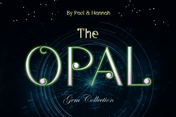
Right away, its character came through: clean, unhurried lines; soft, intentional curves; and those subtle circular terminals—like tiny halos at the ends of strokes. The product description calls Opal “a gem that represents hope, truth, and purity,” and it’s not poetic fluff. In digital space, that translates to a display font that feels both serene and confident—not ornate, not cold, but quietly meaningful.
I dropped The Opal into the hero headline: “Begin With What’s Already Whole.” Instantly, the tone shifted. The circles in the ‘o’, ‘a’, and ‘e’ softened the edges without sacrificing clarity. On desktop, it held weight and grace. On mobile? I checked the 375px viewport—no squinting, no awkward letter collisions. The x-height is generous, spacing is open, and the rhythm invites slow reading rather than skimming. That’s rare for a display font.
As a UI designer, I don’t reach for display fonts lightly. They’re not for body copy—and The Opal isn’t either. But where it shines is in moments that need emotional resonance: a course title on a sales page (“Clarity & Calm: A 6-Week Practice”), a boutique shop banner (“Handwoven • Small Batch • Thoughtfully Made”), or even the tagline beneath a logo in a digital brand kit. It’s the kind of font you use when you want users to *feel* before they read.
Readability stays strong across contexts—but with caveats. Over light backgrounds? Perfect. Over muted image overlays (think soft-focus nature photos), it holds up if you add subtle text shadow or background contrast. On dark mode, I tested it with a 90% white fill and light anti-aliasing—it remained legible without glare. For buttons, I kept it to short CTAs only: “Start Here,” “Join the Circle,” “Explore Practices.” Anything longer starts to lose breath. And never smaller than 24px at desktop, 20px on mobile—even then, only for headings.
Pairing is where The Opal becomes truly versatile. I paired it with Inter for body text on the coaching site—clean, neutral, highly readable—and the contrast worked beautifully: Opal carried warmth and intention; Inter delivered quiet reliability. For a creative portfolio using editorial tones, I swapped in a warm serif like IBM Plex Serif for subheads, letting The Opal anchor the top-level hierarchy. The key is balance: let The Opal breathe, and give supporting text room to serve function without competing.
In real layout tests, it elevated consistency across touchpoints. The same font appeared in the hero, the email header, and social media graphics—and each time, it reinforced a cohesive, human-centered identity. Not “corporate calm,” but *authentic* calm. That matters when your audience is choosing between dozens of wellness offerings online. Typography builds trust before a single sentence is read.
I also checked technical readiness before committing. The webfont package includes WOFF2 files (lightweight, widely supported), multiple weights (Light, Regular, Medium—no bold, which is fine, since boldness here comes from placement and scale, not stroke weight), and Latin-based multilingual support. No OpenType features like stylistic alternates, but none are needed—the design is intentional as-is. Licensing is straightforward commercial use, including client projects and SaaS dashboards—no hidden restrictions for e-commerce banners or course platforms.
Where does The Opal fit best? Think strategic emphasis, not decorative filler. It works powerfully in:
- Hero section headlines and taglines
- Section dividers (“What You’ll Gain,” “How It Works”)
- Course or program names on sales pages
- Branded quote graphics for blog posts or newsletters
- Logo lockups where logotype is part of the brand mark
- Digital ad headlines (especially for mindful, creative, or holistic brands)
It’s less effective—though not unusable—for navigation labels, form fields, or long paragraph breaks. And while it’s lovely in SVG illustrations or animated reveals, avoid overusing motion with it; its strength is stillness and presence.
One unexpected win? Print collateral. When the client asked for matching workshop handouts, The Opal scaled cleanly to 14pt on matte paper—retaining its gentle geometry and warmth. That cross-medium flexibility is a quiet bonus for designers managing full brand systems.
At its core, The Opal reminds me why typography remains one of the most human parts of digital design. It’s not just about letters fitting on screen—it’s about whether the type makes someone pause, exhale, and feel seen. In a landscape full of sharp angles and algorithm-driven aesthetics, a font like this carries quiet authority. It doesn’t shout. It invites.
If you’re refining a portfolio, launching a values-driven product, or rebuilding a brand voice for clarity and care—try The Opal where meaning needs to land first. Then step back. Let the circles do their work.